The Mad Hatter of Concept and Chaos
Meet Baxter
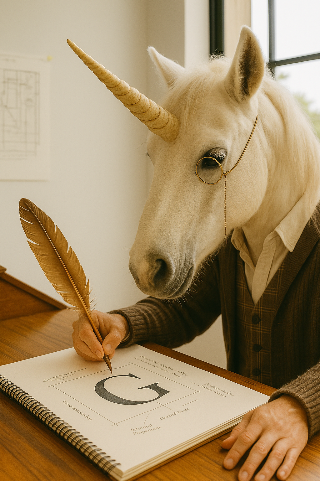
Baxter creates for you. …..but not before changing the playlist five times, lighting a candle, questioning the entire strategy, then deciding it was “too obvious” and starting over from scratch. He is the emotional engine of the House of Artistry. The kind of designer who believes inspiration can strike anywhere—Pinterest, a midnight walk, or the back of a napkin during a nervous breakdown.
Baxter designs with feeling first, logic second:
A font doesn’t just look good; it needs to feel like a personality.
A brand color isn’t chosen because it’s trendy; it’s chosen because it reminds him of “that one sunset in Florence.”
A logo isn’t done until it gives you goosebumps— or at least a tiny existential crisis.
He believes design should speak:
A brand mark should say something before you even read it.
A palette should make you feel something, even if you don’t know why.
A layout should flow like a conversation, not a cold brochure.
A concept should hold story—or back to the drawing board it goes.
He’s missed deadlines, not out of laziness, but because he couldn’t fake the spark. He’s restarted full concepts because “the vibe was off” after sleeping on it. And yes, he once cried over a font pairing that hit too hard at 2:00 a.m.
He is not here to make it trendy. He’s here to make it resonate. When Baxter finally delivers, it’s not just pretty—it’s personal….and when a client says, “That feels like me,” he knows it was worth the chaos.
Before the House of Artistry, Baxter didn’t work in studios — he haunted them. A wanderer with paint under his fingernails and too many sketchbooks in his coat, he was always mid-concept, mid-coffee, mid-meltdown. He once hand-lettered menus in Paris, collaged jazz flyers in New York, and was reportedly asked to leave a design school in Florence after rebranding the campus fountain at midnight.
One morning, she found him on the doorstep of the studio — barehoofed, sketchbook in hand, and a folder titled “vibes in progress.” When asked what he was doing there, he said, “Waiting for the right brand to find me.” She didn’t flinch. She offered him a job.
Now, Baxter works in beautiful disarray: three open sketchbooks, five playlists deep, a cold coffee, and a file named “vibe_draft_final_final_THISone.psd.” He doesn’t design for trends. He designs for goosebumps. A font has to feel like a mood. A logo has to whisper something back. And if it doesn’t move you — emotionally, aesthetically, existentially — it’s not done.
Meet the Team
-

Samantha Rachelle
Founder
Slightly feral visionary behind the House of Artistry -

Theodore
The Llama Butler
The Butler of Boundaries, Precision, and Tasteful Disapproval